Friday, June 29, 2012

June Tag Challenge Photo Tinting


Well, it's the end of the month and I'm back again with my June Tag for Tim Holtz 12 Tags of 2012 (click the link for Tim's step-by-step instructions).  It would seem that I do better waiting until the last minute...and so it goes.  This month he has a video showcasing a technique for photo tinting.  Did you know that Distress Inks were formulated for use in tinting photos??  I didn't...and so I gave it a try, and I'm sold!  The photo of the girl & teddy bear is a free download on Tim's post -- and normally I like to venture off the path a bit, but I really liked the image and the design elements he used for his example, so I went with it. 

LoveLee Details:  I {slightly} matted my photo with a piece of brown paper gift bag with the phrasing, "Way Down East" showing slightly below.  The marbled background is white picket fence & peeled paint distress stain, with a variety of stamps from TH lost & found, mixed media, & curiosities sets stamped in black archival ink.  The photo tinting was achieved with victorian velvet (for the dress & bow), & gathered twigs (for the bear), finishing with antique linen & vintage photo.  I didn't have the nibs mentioned in the video, so I used Fantastixs by Tsukineko instead...they worked great.  To finish the photo, I over-stamped with a tiny journey word stamp with black soot distress ink. 

The ribbon was colored with peeled paint & weathered wood distress stains, and the rose trimmings with fired brick.  There's just a snippet of "script" tissue tape under the roses, and the film strip ribbon was stapled to the tag with my tiny attacher.  Finally, I adhered the word band "Capture Life's Moments" (painted with Making Memories "celery") to the tag with the ribbon. 

What a fun technique...if you haven't tried it before you might want to give it a try.  I think it would make for some fun framed photos.

TFSB, and have a lovely day!  Lisa

Thursday, June 28, 2012

Organizing Clear & Cling Foam Stamps

UPDATE 8-27-13:  Check out My Craft Closet for a video of my stamp storage updates.

I'm popping in today to share how I store my clear & cling stamps.  If you hadn't yet guessed, I love organization products...love, love, love them! Recently, I was a winner (out of 1119 commenters) of blog candy from Becca's blog:  Amazing Paper Grace (APG).  Oooo, if you haven't visited her blog before, you will just love her style of elegant cards & projects. 

The blog candy she offered was provided by TapeOnline.com -- I received 20 clear "dvd type" cases and 20 magnetic sheets, for organizing Spellbinder dies & cling stamps.  The cases are crystal clear, the price point is fantastic, and their customer service & shipping is simply amazing -- I received them within a couple days of winning!  I know I was a winner, but check out the TapeOnline product links below to see what I'm talking about; and while you're there you can see what the reviews are saying as well. 

Clear Stamp Cases
Magnetic Sheets

I don't have a lot of Spellbinder dies (the ones I do have were bought after seeing some lovely projects created by Becca on APG), but for the few I have I added the magnet sheets to the cases to store those dies.  I wrote the die information on the case spine with my white Sakura Souffle pen, and taped the packing/"sandwich" info to the back of the case.  For my dies, I like having the package information handy as it helps to see what the die should look like when cut.  If you haven't yet seen an earlier post for organizing my other diecut packaging, you can view the "Packaged Die Organizer" HERE.


I do have loads of stamps -- especially the little clear stamps that get easily lost or misplaced once they leave their little protective sheet.  So I used the clear cases for quite a few of my clear stamps -- obviously I'll have to buy more (you haven't seen my collection of Christmas stamps yet -- lol).  I love how clearly the stamps show through.  The clear stamps adhere to the plastic case quite well, and on many of the stamps I left top plastic overlay so I could determine what the stamped image actually was; in the case of no visible image for the clear stamps I intend to stamp the image on a piece of clear transparency to include in the case.  And instead of keeping the paper packaging for the stamps (with the stamp company name/image names), I just wrote with a large sharpie on the spine of the cases.  Some of the stamps packaging fit perfectly into the cases, so I included them with the stamps.

Originally this bin held my CTMH stamps, but I've since moved them --
so I guesss I need to re-label this bin.  =)
I store my cling foam stamps in bins (they were part of rolling bin set but the frame & rollers broke) that I keep on an old bookshelf.   The cling foam stamps are a bit thicker, & the packaging larger, so I store those in pocket envelopes.  The refill pockets were originally made for Tim Holtz' Stamp Binder, but since I have so many of the cling mount stamps I find it easier to have the pockets in this bin as well, so I can leaf through them at a glance.

Since space is always at a premium, as often as we move, I have un-mounted some of my wood block stamps and put them on EZFoam to create a cling mounted rubber stamp.  However, I do still have some wooden stamps that I keep in a labeled drawers that I don't intend on un-mounting...yet.  

There's a lot you can do with these clear cases besides thin metal dies & stamps.  Check out another cool organization idea that Becca used them for:  Inky Nib organizer

Now I wonder...what would you use them for?  TFSB!  Lisa

Many, many thanks go out to Becca of Amazing Paper Grace, and Emily at TapeOnline.com -- I love my new organization goodies. You guys are absolutely lovely! 

Monday, June 11, 2012

Apples for Everyone

What do you see?
I thought I'd show an Art Journal page I created, step-by-step for the background, using The Crafter's Workshop (TCW) Wood Grain stencil. You might remember I like to look at things a bit differently...or upside down as in my Masks of the Manor post a couple years ago when I turned my cricut books upside down to find more interesting ideas.   Anyway...When I was thinking about buying the large wood grain stencil I saw what looked like several faces in the design, which gave me lots of ideas ... and then just had to have it. =)  I'm showing one of the ideas I had for this stencil in my art journal.  Everytime I look at the stencil I see it a bit differently, so I'll revisit this again later down the road. 

To begin...these pages started out as a place to wipe off my paint brush from another project. 

Didn't have a towel handy so I wiped off my brush of purple paint onto these pages.

 Adirondack pebble colored paint dabber to paint over TCW wood grain stencil. 


 Added a paint wash of Manila colored paint. 


 Thought it needed a second coat of Manila paint wash.


Added vintage photo distress ink over the pages, direct to paper.


With a blending tool, I randomly added walnut stain distress ink over the stencil,
keeping it slightly askew, to give it a bit more definition.

 
And now...the finished pages.  I drew in where I imagined the face in the tree to be and stamped apples & leaves on the adjoining page. I created a notice on the tree using a watercolor black paint wash, distressed the edges, used the Tim Holtz distress hammer to indent the brads and wrote with permanent marker & Signo white gel pen the "Notice" sign.  The apple w/leaves stamp is from Stampin' Up (Sun-Ripened II stamp set), and I used barn door & peeled paint Distress Markers for the coloring. 

I just realized the green ink blot at the bottom...a carry over from another page of playing.  I think I'll add another green leaf to that area to tie it into the page, but otherwise it really doesn't bother me.  Just the perks of finding more ways to integrate "messes" into the "art" of the moment. 


NOTICE:  The Wicked Witch is dead ... Apples For Everyone!

Try looking at something a bit different and see where it creatively takes you...you just might be surprised!  Lisa

Friday, June 1, 2012

Just a Note for the Graduate

ConGraDulations!

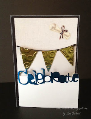
I'm back today with some Graduation cards I've been working on.  I used my Cricut Expression2 Anniversary edition (CE2) for these cards...which is important to note...since the cartridge for this particular type card is preloaded on the machine, and called "Just A Note".  I also used the Wrap it Up cart. 

The concept is fairly simple...which is basically cardstock folded into thirds...with the left side foldover cut off 1/3 way down, and the right side foldover cut off 2/3 way down for a tiered tri-fold card.  However, using the CE2 to cut out the words and images did make it a lot easier -- except when you're making four of them in the various school colors.  LOL.  I'd have to say that took a bit more time, but I really like the way they turned out. 


I actually made three, then had another grad announcement from a friend for her Bachelor's degree...so I made a fourth.  The last one I made I used a German foil for the banners, celebrate, & tassel.  It was a bit more delicate to cut, so I used a medium paper setting and cut it out at a slower speed.  Speaking of the German foil, if you missed the post using it for faux Dresden, you can check it out HERE..


All the banner cards were cut at 5 1/2" including the layered features (card & card layers). When cutting the banners for the inside feature I used the flip feature to mirror the image.  The Graduate w/Hat phrase was cut from the Wrap it Up cartridge at 2 1/2", but for the tassel I used the layer feature and cut it at 2". 

I added a colored mat backing to give the cards a bit more depth & color (they just seemed a bit plain).  I inked the banners on three of the grad cards according to their school colors -- that way I could use white deco paper for all the banner cuts, yet have them match the cards individually.  I also added a quote, and used stickles to "bling" up the cards just a bit.  To finish these cards up, I rolled up a check ($$) and tied it with hemp cord 4-5x then adhered it to the card (diploma style) by using 1/4" score tape on the back layer of hemp cording.  I ran distress markers over the bows for additional color.  The diploma (check) can easily be removed by pulling it out of the cording.


For the foiled card -- the foil was a bit delicate to cut for the wording and had to be pieced in some areas, but on the whole it turned out great.  Because it's quite a thin foil I didn't even have to pull out my Cuttlebug to emboss the banner pieces.  I just set them inside the Spots & Dots embossing folder and pressed with my fingers -- can't get easier than that.  =)  I added a sticker diploma that had red in the ribbon, so I used a Sakura Glaze pen in blue to change out the color.  I left a slight shadow of the red on the edges for the look of dimension.  Finally, I used photo corners to hold in a gift card...adding a quote just behind it to show once it is removed.


Congratulations to all the graduates this year...You Did It!!  Lisa

Thursday, May 31, 2012

Tissue Paper & Faux UTEE


My finished Art Journal pages
You can still see the bursts of colorspray
I was covering up, in this photo,
but they're not so prominent in the
finished pages.
I'm just in under the wire to participate in Tim Holtz' 12 Tags of 2012 for May, with a completed a page in my Art Journal for this challenge...slightly bigger than a tag.  =) Thankfully, the challenge doesn't have to be a tag, but to help inspire something creative in us...and that it did!

For my journal pages, I repurposed tissue paper from a store that had used it to wrap something breakable in.  It already had a printed motif on it, but I cut the design pieces out and randomly adhered them to my already painted & stencil pages (up to this point, I had slightly covered up some random color sprays with gesso and Archival ink...and added a Dylusion stencil for the border).  I added distress ink with a foam applicator over the tissue paper, then partially colored some of the images with distress markers.  For added dimension & effect I also colored with Souffle & Glaze pens.

I didn't have UTEE (ultra thick embossing powder) readily available, so I added extra Glossy Accents to the flower embellishments, in its place, to create the faux UTEE effect.  I finished off the pages with some stamped sentiments (CTMH) & a stamped compass embellishment using the same faux UTEE effect...which took an extra coating, and lots of drying time (one of the down sides of not having the UTEE available).  I had made extra of the compass embellishments from a Tag Swap for ATT a while back, and it came in handy for this page.

Glossy Accents helped give these flowers the look of UTEE
So far I haven't missed one of the 12 Tags of 2012, but I sure came close this time.  And with that, I'll say good-night to May, 2012.

Pleasant dreams!  Lisa 

Friday, May 25, 2012

Washi Paper Art Journal Page

Thanks Mhel!
I was having tea with a friend the other day, on her birthday, and guess what she brought Me?  Washi Paper! She bought when her family was stationed in Japan awhile ago, but since she hadn't used it she thought I might be able to use it my crafts.  Wasn't that so sweet?!  Since I've been working in my art journal I thought what's a better place to incorporate an artistic styled memory.  I love having an art journal where I can incorporate things like that. 

So this is my collage page of washi paper, combined with mini Sakura Glaze hearts, & a large glittered heart covered with Glossy Accents.  I used a bit of antique linen distress ink to steer it away from a stark white page, but I left just bits of the white showing through for added variance.  The collaged effect is great when you're trying to break up a busy design. 

Hope you can enjoy today with friend too.  Lisa

Saturday, May 12, 2012

Gift Boxes Simply Repurposed

I know I've been scarce the past two weeks, but I'm popping in today for a great repurposing project & quick gift idea.  The other day I was drinking some tea my MIL sent me when I got to looking at the box, thinking it would make great packaging for the Dark Chocolate Edamame (from Trader Joes) I wanted to add to my Mother's Day gifts. 

Now I should mention that I do have a Cricut that can cut quite a few boxes, but I really like doing things from near scratch as well...and repurposing/recycling projects are my favorite (if you hadn't guessed).  So, instead of throwing away the tea box, I carefully opened it up at the seam where it was glued together and made a template by drawing around the box onto 12"x12" white cardstock, and cut it out. 
Christmas Tea Box -- ribbon has been removed (and repurposed on another card)

12" x 12" white cardstock -- dotted lines are for score lines
Then using the original box as a guide, I used my ruler to make light pencil lines where the score lines should go and added darker dotted lines (over the lighter pencil lines) to show where to score.  I used my score board to score the template and made sure it would form the packaging correctly (without adding any adhesive).  This is now the template I'll be keeping for future boxes. 

NOTE:  I could have used the original box as a template, but I find the original packaging can be distracting when trying to follow score lines and cut lines.  Also, I had already cut the panel off one side of the box -- I like keeping tea fresh in canisters, etc., and I include a snippet of the tea info with it. 

Template cut out and ready to be scored

Template scored & folded - left tabs will hold the adhesive


Using the template, I drew around the deco cardstock (CS) I chose for the boxes and cut them out.  Instead of drawing on the score lines, I laid the template over top of the deco CS and scored them both together.  If you choose, you can draw light pencil lines on your deco CS and score them individually. 
SCORING TIP:  Because of the odd shape of the CS once cut, it makes it difficult to line up on your score board.  I found an easier way to do this by laying down your ruler at the bottom of your CS, and lining up where you'll begin scoring with a particular number on the score board (ie. 4"), with where the score line should end on your CS set to the same measurement on your ruler (ie. 4").  I like to use Tim Holtz Ideaology Ruler because it is exact, without any lead-space on the front end of the ruler.  I also use the Martha Stewart Score Board because I like the 1/8" spacing and the right side of the board being open.
(If this score tip doesn't make sense, I'll try to update this posting with a YouTube video this week.)

Note the 4" score line matches both top & bottom measurements

**If you look at the image above, the 4" score line at the top of the score board lines up with the 4" line on the ruler at the bottom. To make sure your ruler will give you straight lines and match up with the score board lines, hold the ruler flush against the top & left side of the score board -- your measurements should match up.  This will help give you accuracy when scoring mis-shaped objects.**

For the boxes I made, I only glued the side seam together, and folded the bottom of the box without adding adhesive.  That way, if they want to reuse the box later (more repurposing) for another's gift, they can open up the bottom, fold the box flat and store it for use another time.  I forgot to take a picture of the contents, but I used cello bags for my Chocolate Edamame and added a tag. 
The finished gift boxes

Other ideas you could fit in these boxes are mini purse notebooks, deco tissue packs, bath beads, soaps, jewelry, gift cards, etc. (if you use heavier items, I'd recommend adding adhesive to the bottom of the box).  My Grandmother is diabetic but loves chocolate, so I found some yummy sugar-free chocolates to add to hers.  =)  Wouldn't these be great gifts to make just to cheer someone's day?  I just think they are a "sweet" addition to any gift basket.

I hope all you Mothers out there have a LOVELY Mother's Day!!  Lisa

Tuesday, April 24, 2012

Creative Passage Into Art Journaling

"Go where your journal takes you creatively, taking your journal wherever you go --
and you'll find you're taking a creative journey, others will soon want to follow."
~ Lisa Sackett

I thought I'd share something a bit new today...something that I've been working on for a while, behind the scenes -- my Art Journal.  If you're not familiar with Art Journaling, it's basically combining art & words into a personal journal (or just words, or just art...) -- it's a creative outlet of your own artistic impression.  In other words, there are no rules -- you create the kind of art that you enjoy, and write what you like. 

One of the best things I've discovered about keeping an Art Journal (or several) is that it truly helps the break-down of inspiration overload.  You know what I mean?  When you are overstimulated by SO many ideas going through your head and don't know where to begin -- I find that taking just ten to fifteen minutes to add some color to a page, adding collage elements, drawing, writing, etc...just helps to get that creative energy moving in a specific direction.  And it works exactly the same way when I can't think of a thing to do.  And once you get started, you'll be able to go back into your journals for some of your own inspiration!  You'll also find it quite addicting...and dare I say...FUN!


Creative Passage Into Art Journaling
. . . the class!

Many of you already know I'm an instructor at our LSS.  Well, I was thinking that an Art Journaling class would be a great opportunity to bring together students, who are both beginner & advanced artists, for the express purpose of having fun being creative without any rules.  And if you don't think you're artistically inclined, not to worry -- I'll help you find your creative style.

Starting in May at our LSS (15 minutes from the St. Louis Arch), I'll begin teaching Art Journaling 101 -- you'll get your initial supplies, including a journal, and we'll jump right in.  Then each month I'll be teaching new techniques you can try out on your own pages, or you can do your own thing.  There will be a variety of supplies & tools to use while in class, & each month you'll acquire some new supplies too!  Art Journaling is meant to be a fun, stress-free, relaxing way to get creative. Some pages you'll love, others you'll learn from.  But most of all ... we'll just have fun! 

To sign up for classes you can contact The Scrapbook Factory at 618-628-8877.  Several opportunities for class dates in May:  Sunday, May 20th 2-4pm; Tuesday, May 22nd 5:30-7:30pm; Saturday, May 26th 10am-12pm.  Classes fill up quickly as there are only 12 spaces open for each class.  If you have a group of five or more we'll create a class for your group...just let me know.  Also, each month will include an Art Journaling 101 class for those that are just starting up.

Still unsure about this Art Journaling "thing"?  Check out this link for some great inspiration --> HERE, featuring Dyan Reavely.  We'll be using her Dylusions sprays & stencils in some of the classes.  But that's only a sampling, there's so much more... 

On my blog -- I'll be posting my journal pages from time to time, including tidbits here and there, as well -- so that if you're not able to join us in classes, you'll still be able to catch a bit of that inspiration.

So that's just a little something new I've got going on...and I thought I'd put you in the know.  And now you know.  =)

Have a cozy day!  Lisa

Monday, April 23, 2012

April's Tag is a Birthday Card

Today's birthday card is gonna be a bit late for my brother-in-law, but on time (finally) for Tim Holtz'  12 Tags of 2012 for April.  I decided to make this into a dual purpose card, since I had a birthday to fulfill. 

I followed Tim's blog tutorial with a few stylistic changes based on the materials I had on hand:

TH Distressed Frame embossing folder
TH Reflections script stamp
TH Lost & Found flying birds stamp
TH Shabby French bird stamp (fussy cut - which is just another name for spending a lot of time cutting something out  =)
grungeboard bookplate & keyhole
TH trimmings inked w/frayed burlap & peeled paint
7 Gypsies key
Distress Inks:  frayed burlap, scattered straw, peeled paint, stormy sky, & vintage photo
Archival Ink: black, cobalt
Jute, stapled with TH tiny attacher
variety of letter rub-ons

And here's a Tip about shadowing rub-ons:  adhere rub-on to cardstock, then go over it carefully with an inked blending tool after it's secure -- this will give a shadowed look to your rub-on, as the overflow material on the rub-on acts as a natural resist.  In my case I used white cardstock then went over it with stormy sky & frayed burlap.  You can see where the letters have a white shadowed effect.  Pretty cool, eh?

Hope you're having a fabulous day!  Lisa

Friday, April 6, 2012

Easy Watercolored Spring Rabbits

Spring Easter Rabbits

Hi guys! Popping in today to show a couple cards I made using the new Distress Markers on specialty stamping paper. I'm loving using these markers for watercoloring, and I actually like the stamping paper for this technique as much as watercolor paper, as it really gives such a crisp image. The stamps were picked up a few years ago at a thrift store -- The only name on them is "Imaginations!" (I looked online, but could only find them on eBay).

I'm not extremely neat when I "color", so using the watercolor method with these markers works really nice for me. I simply stamped the images with Archival black ink (any waterproof/non-smear ink should work) and colored over the images with a the markers. Then I used a water brush and "water-colored" over the marker colors (wiping off my brush on my hand between each color). I used a wet brush so there was extra water to move around in the ink, then I dabbed up the extra water with a towel when I was finished with that color. It helped give it the mottled look of watercolor. I corner rounded the image paper, and finished with my markers by going around the edges of the paper (and not neatly, I might add). I then used the water brush again around the edges, dabbed with a towel, & dried, before going over it once again with the water brush for a lighter, third coloring on the edges.  Check out Tim Holtz demonstrating these markers, the stamping paper, and the water brush (at 3:45) , on YouTube ---> HERE


I used Glaze pens for the extra pop of color on the watermelon, carrot, & tulip -- the Glaze pens dry slightly raised with a glossy finish...as opposed to Souffle pens which give a matte finish.   I added the images to cardstock from my scrap collection, and tied on ribbon bows. To finish off the cards, I punched out mini envelopes (by McGill) from vellum and added a "Hoppy Easter" message.


I thought these rabbits were more spring-time than Easter, which is a bit more my speed. Growing up the first of six kids I remember my parents celebrating Easter on Saturday with our egg hunts & candy baskets, and Sunday was set aside as "Resurrection Sunday". We were able to have all day to enjoy our goodies instead of rushing off to church after we'd found them...plus it helped us keep in perspective the true meaning of Easter & Jesus' resurrection. We've followed that same tradition with our own kids, and I love the simplicity of a relaxed Saturday morning -- well, except when we can't remember where we hid the last boiled egg. =)

Today we're remembering Good Friday, but isn't it wonderful to know
...Sunday's a-comin'?!   Blessings, Lisa