Friday, June 29, 2012

June Tag Challenge Photo Tinting


Well, it's the end of the month and I'm back again with my June Tag for Tim Holtz 12 Tags of 2012 (click the link for Tim's step-by-step instructions).  It would seem that I do better waiting until the last minute...and so it goes.  This month he has a video showcasing a technique for photo tinting.  Did you know that Distress Inks were formulated for use in tinting photos??  I didn't...and so I gave it a try, and I'm sold!  The photo of the girl & teddy bear is a free download on Tim's post -- and normally I like to venture off the path a bit, but I really liked the image and the design elements he used for his example, so I went with it. 

LoveLee Details:  I {slightly} matted my photo with a piece of brown paper gift bag with the phrasing, "Way Down East" showing slightly below.  The marbled background is white picket fence & peeled paint distress stain, with a variety of stamps from TH lost & found, mixed media, & curiosities sets stamped in black archival ink.  The photo tinting was achieved with victorian velvet (for the dress & bow), & gathered twigs (for the bear), finishing with antique linen & vintage photo.  I didn't have the nibs mentioned in the video, so I used Fantastixs by Tsukineko instead...they worked great.  To finish the photo, I over-stamped with a tiny journey word stamp with black soot distress ink. 

The ribbon was colored with peeled paint & weathered wood distress stains, and the rose trimmings with fired brick.  There's just a snippet of "script" tissue tape under the roses, and the film strip ribbon was stapled to the tag with my tiny attacher.  Finally, I adhered the word band "Capture Life's Moments" (painted with Making Memories "celery") to the tag with the ribbon. 

What a fun technique...if you haven't tried it before you might want to give it a try.  I think it would make for some fun framed photos.

TFSB, and have a lovely day!  Lisa

Thursday, June 28, 2012

Organizing Clear & Cling Foam Stamps

UPDATE 8-27-13:  Check out My Craft Closet for a video of my stamp storage updates.

I'm popping in today to share how I store my clear & cling stamps.  If you hadn't yet guessed, I love organization products...love, love, love them! Recently, I was a winner (out of 1119 commenters) of blog candy from Becca's blog:  Amazing Paper Grace (APG).  Oooo, if you haven't visited her blog before, you will just love her style of elegant cards & projects. 

The blog candy she offered was provided by TapeOnline.com -- I received 20 clear "dvd type" cases and 20 magnetic sheets, for organizing Spellbinder dies & cling stamps.  The cases are crystal clear, the price point is fantastic, and their customer service & shipping is simply amazing -- I received them within a couple days of winning!  I know I was a winner, but check out the TapeOnline product links below to see what I'm talking about; and while you're there you can see what the reviews are saying as well. 

Clear Stamp Cases
Magnetic Sheets

I don't have a lot of Spellbinder dies (the ones I do have were bought after seeing some lovely projects created by Becca on APG), but for the few I have I added the magnet sheets to the cases to store those dies.  I wrote the die information on the case spine with my white Sakura Souffle pen, and taped the packing/"sandwich" info to the back of the case.  For my dies, I like having the package information handy as it helps to see what the die should look like when cut.  If you haven't yet seen an earlier post for organizing my other diecut packaging, you can view the "Packaged Die Organizer" HERE.


I do have loads of stamps -- especially the little clear stamps that get easily lost or misplaced once they leave their little protective sheet.  So I used the clear cases for quite a few of my clear stamps -- obviously I'll have to buy more (you haven't seen my collection of Christmas stamps yet -- lol).  I love how clearly the stamps show through.  The clear stamps adhere to the plastic case quite well, and on many of the stamps I left top plastic overlay so I could determine what the stamped image actually was; in the case of no visible image for the clear stamps I intend to stamp the image on a piece of clear transparency to include in the case.  And instead of keeping the paper packaging for the stamps (with the stamp company name/image names), I just wrote with a large sharpie on the spine of the cases.  Some of the stamps packaging fit perfectly into the cases, so I included them with the stamps.

Originally this bin held my CTMH stamps, but I've since moved them --
so I guesss I need to re-label this bin.  =)
I store my cling foam stamps in bins (they were part of rolling bin set but the frame & rollers broke) that I keep on an old bookshelf.   The cling foam stamps are a bit thicker, & the packaging larger, so I store those in pocket envelopes.  The refill pockets were originally made for Tim Holtz' Stamp Binder, but since I have so many of the cling mount stamps I find it easier to have the pockets in this bin as well, so I can leaf through them at a glance.

Since space is always at a premium, as often as we move, I have un-mounted some of my wood block stamps and put them on EZFoam to create a cling mounted rubber stamp.  However, I do still have some wooden stamps that I keep in a labeled drawers that I don't intend on un-mounting...yet.  

There's a lot you can do with these clear cases besides thin metal dies & stamps.  Check out another cool organization idea that Becca used them for:  Inky Nib organizer

Now I wonder...what would you use them for?  TFSB!  Lisa

Many, many thanks go out to Becca of Amazing Paper Grace, and Emily at TapeOnline.com -- I love my new organization goodies. You guys are absolutely lovely! 

Monday, June 11, 2012

Apples for Everyone

What do you see?
I thought I'd show an Art Journal page I created, step-by-step for the background, using The Crafter's Workshop (TCW) Wood Grain stencil. You might remember I like to look at things a bit differently...or upside down as in my Masks of the Manor post a couple years ago when I turned my cricut books upside down to find more interesting ideas.   Anyway...When I was thinking about buying the large wood grain stencil I saw what looked like several faces in the design, which gave me lots of ideas ... and then just had to have it. =)  I'm showing one of the ideas I had for this stencil in my art journal.  Everytime I look at the stencil I see it a bit differently, so I'll revisit this again later down the road. 

To begin...these pages started out as a place to wipe off my paint brush from another project. 

Didn't have a towel handy so I wiped off my brush of purple paint onto these pages.

 Adirondack pebble colored paint dabber to paint over TCW wood grain stencil. 


 Added a paint wash of Manila colored paint. 


 Thought it needed a second coat of Manila paint wash.


Added vintage photo distress ink over the pages, direct to paper.


With a blending tool, I randomly added walnut stain distress ink over the stencil,
keeping it slightly askew, to give it a bit more definition.

 
And now...the finished pages.  I drew in where I imagined the face in the tree to be and stamped apples & leaves on the adjoining page. I created a notice on the tree using a watercolor black paint wash, distressed the edges, used the Tim Holtz distress hammer to indent the brads and wrote with permanent marker & Signo white gel pen the "Notice" sign.  The apple w/leaves stamp is from Stampin' Up (Sun-Ripened II stamp set), and I used barn door & peeled paint Distress Markers for the coloring. 

I just realized the green ink blot at the bottom...a carry over from another page of playing.  I think I'll add another green leaf to that area to tie it into the page, but otherwise it really doesn't bother me.  Just the perks of finding more ways to integrate "messes" into the "art" of the moment. 


NOTICE:  The Wicked Witch is dead ... Apples For Everyone!

Try looking at something a bit different and see where it creatively takes you...you just might be surprised!  Lisa

Friday, June 1, 2012

Just a Note for the Graduate

ConGraDulations!

I'm back today with some Graduation cards I've been working on.  I used my Cricut Expression2 Anniversary edition (CE2) for these cards...which is important to note...since the cartridge for this particular type card is preloaded on the machine, and called "Just A Note".  I also used the Wrap it Up cart. 

The concept is fairly simple...which is basically cardstock folded into thirds...with the left side foldover cut off 1/3 way down, and the right side foldover cut off 2/3 way down for a tiered tri-fold card.  However, using the CE2 to cut out the words and images did make it a lot easier -- except when you're making four of them in the various school colors.  LOL.  I'd have to say that took a bit more time, but I really like the way they turned out. 


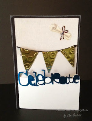
I actually made three, then had another grad announcement from a friend for her Bachelor's degree...so I made a fourth.  The last one I made I used a German foil for the banners, celebrate, & tassel.  It was a bit more delicate to cut, so I used a medium paper setting and cut it out at a slower speed.  Speaking of the German foil, if you missed the post using it for faux Dresden, you can check it out HERE..


All the banner cards were cut at 5 1/2" including the layered features (card & card layers). When cutting the banners for the inside feature I used the flip feature to mirror the image.  The Graduate w/Hat phrase was cut from the Wrap it Up cartridge at 2 1/2", but for the tassel I used the layer feature and cut it at 2". 

I added a colored mat backing to give the cards a bit more depth & color (they just seemed a bit plain).  I inked the banners on three of the grad cards according to their school colors -- that way I could use white deco paper for all the banner cuts, yet have them match the cards individually.  I also added a quote, and used stickles to "bling" up the cards just a bit.  To finish these cards up, I rolled up a check ($$) and tied it with hemp cord 4-5x then adhered it to the card (diploma style) by using 1/4" score tape on the back layer of hemp cording.  I ran distress markers over the bows for additional color.  The diploma (check) can easily be removed by pulling it out of the cording.


For the foiled card -- the foil was a bit delicate to cut for the wording and had to be pieced in some areas, but on the whole it turned out great.  Because it's quite a thin foil I didn't even have to pull out my Cuttlebug to emboss the banner pieces.  I just set them inside the Spots & Dots embossing folder and pressed with my fingers -- can't get easier than that.  =)  I added a sticker diploma that had red in the ribbon, so I used a Sakura Glaze pen in blue to change out the color.  I left a slight shadow of the red on the edges for the look of dimension.  Finally, I used photo corners to hold in a gift card...adding a quote just behind it to show once it is removed.


Congratulations to all the graduates this year...You Did It!!  Lisa